Gig Harbor Farmhouse
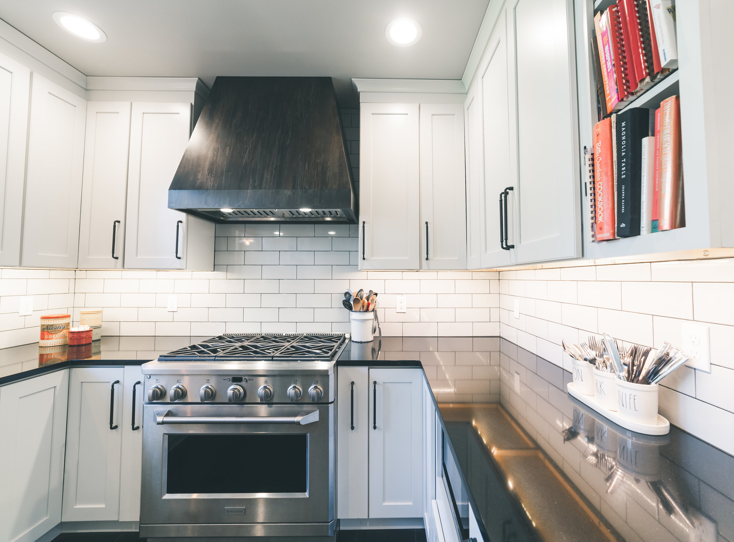
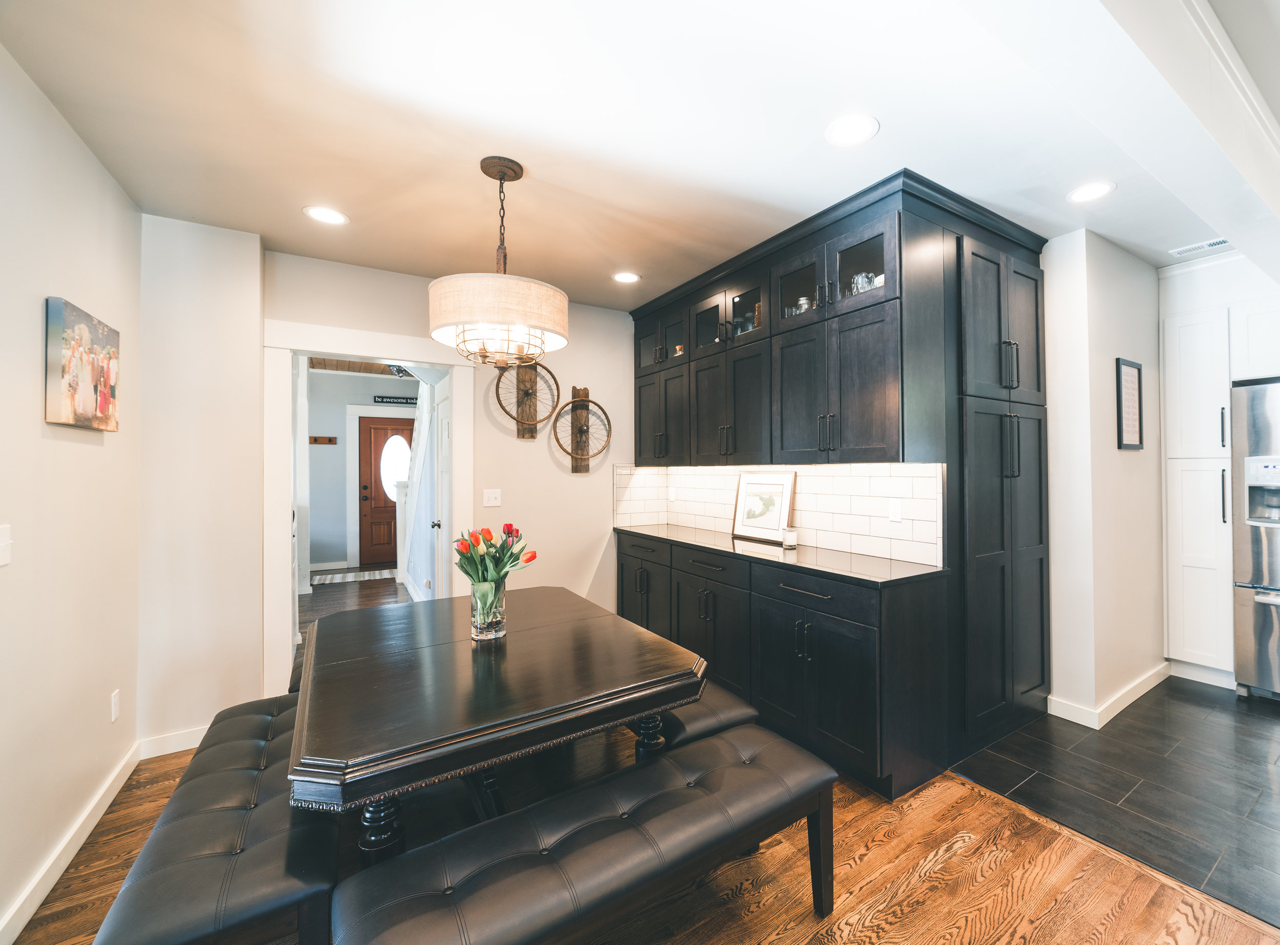
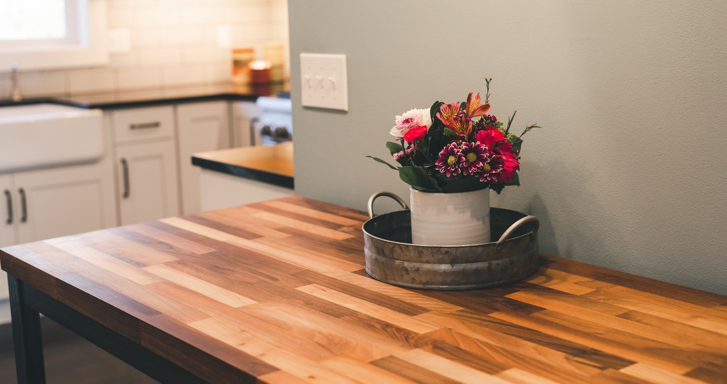
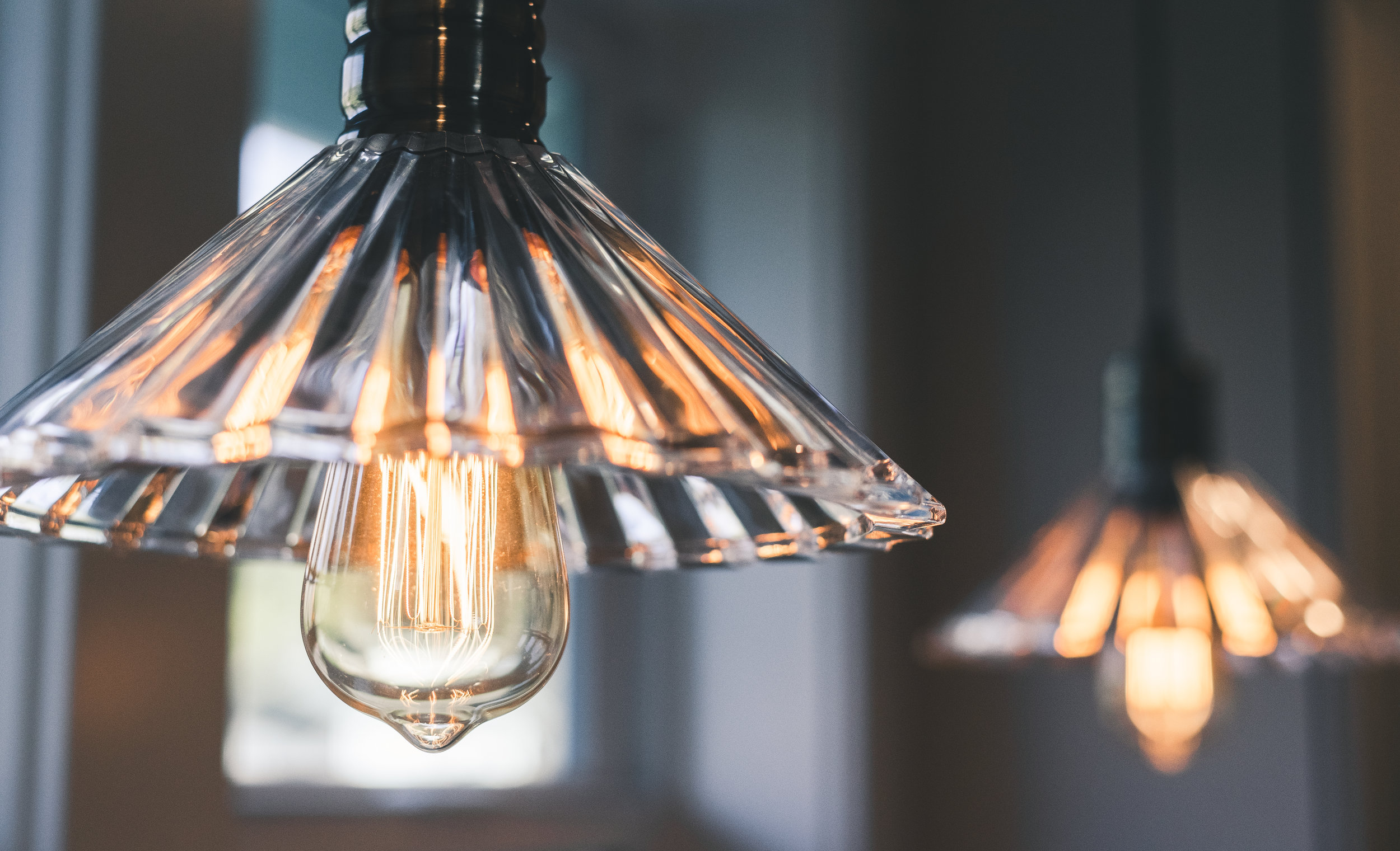
We're moving out! Literally! This kitchen was originally half this size with an equally small dining area, no counter space, and awkward storage. So out we went! Where the white cabinetry area is now used to be a flat wall. It was pushed out as a new addition 10' or so to create a new kitchen space that separated the dining area. Style wise, it was super fun to play with the idea of farm house meets industrial in a century old farm house The owner was keen to keep the historic elements of her home prominent but really loved the look of the darker colors that an industrial vibe brought. We accomplished the look by using both black and white shaker style cabinets, dark tile and counter tops, and a super cool custom metal hood. The homeowner found some vintage inspired pendant lights over the sink and had her son make the butcher block cart. The overall look is not overpowering but makes an huge impact.


